Dashboards made to answer users’ frequently asked questions upfront
Year
2022

Overview
It had been repetitively requested from both in and out, that we need a better dashboard that provides more data. Customer requests on i.e. visitor data, community representativeness, and overview of all tools were constantly coming in. Our squad made the strategic decision to overhaul our existing dashboards and introduce new data on the product. This initiative aims to provide more value and insights to platform managers, and to further decrease the time and effort from customer-facing teams who need to answer data-related questions.
Client
CitizenLab is a community engagement platform used by local governments and organisations to engage their community members. The company offers engagement tools such as surveys, ideation, participatory budgeting, online workshops, and input analysis.
My role
As a product designer, I was a part of Insights Squad that implements data-rich tools such as dashboards, text analysis, and project reports. The team consisted of one product manager, one tech lead, 4 developers, one data analyst, and me.
The Problem
“I’d like to see all engagement data in the dashboard. Right now we only highlight a fraction of them, which is not a full picture of what’s happening on the platform.”
— City
“(We want) More analytics in the dashboard. The number of visitors for example, is something we always show to customers (from the 3rd party tool) because it’s an added value and linked to our company objects.”
— Government Success Manager
The Process
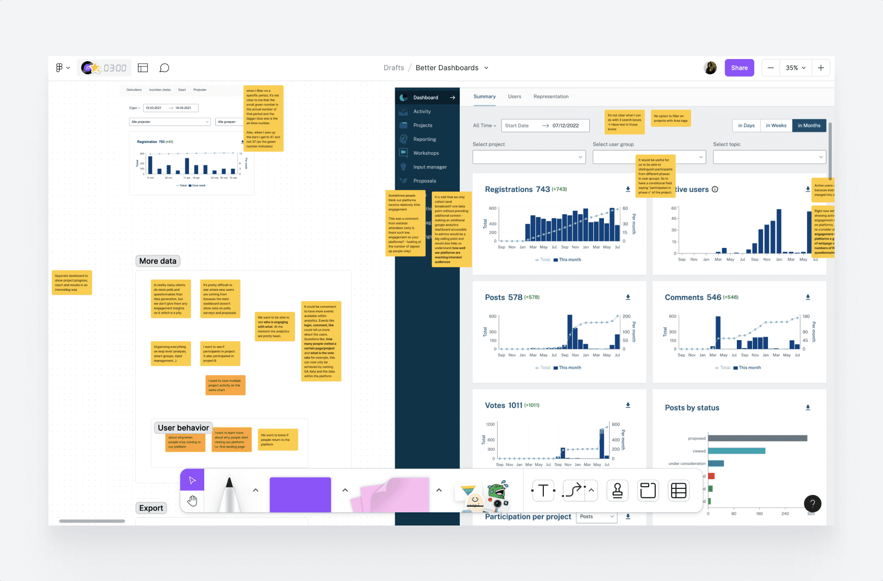
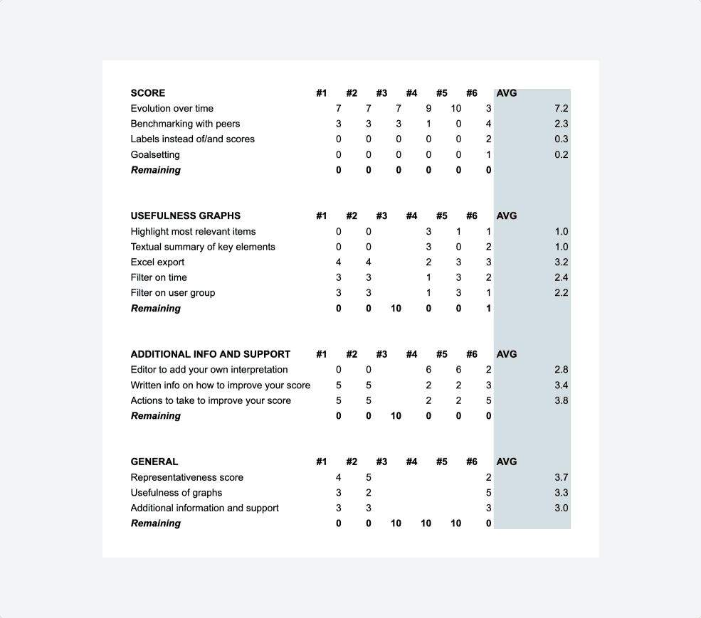
Starting from 51 frequently asked questions
A former product manager had created a list of data questions that can’t be answered through the existing dashboards (image above), and that GovSuccess managers were frequently requested to manually work on.
Our squad had a goal of answering 30+ of these questions through the new dashboards. Based on this, my idea was to have multiple dashboards, themed as:
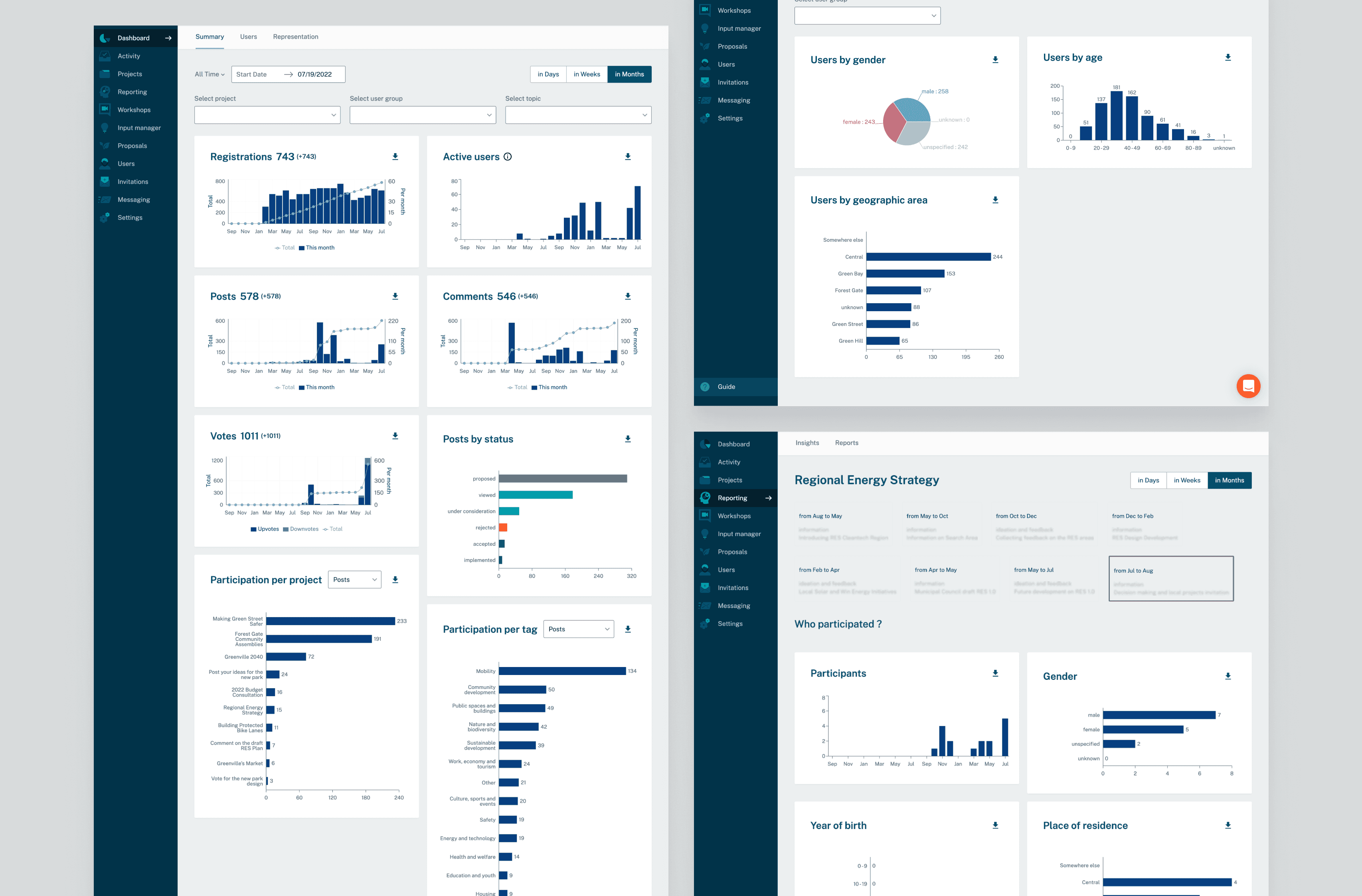
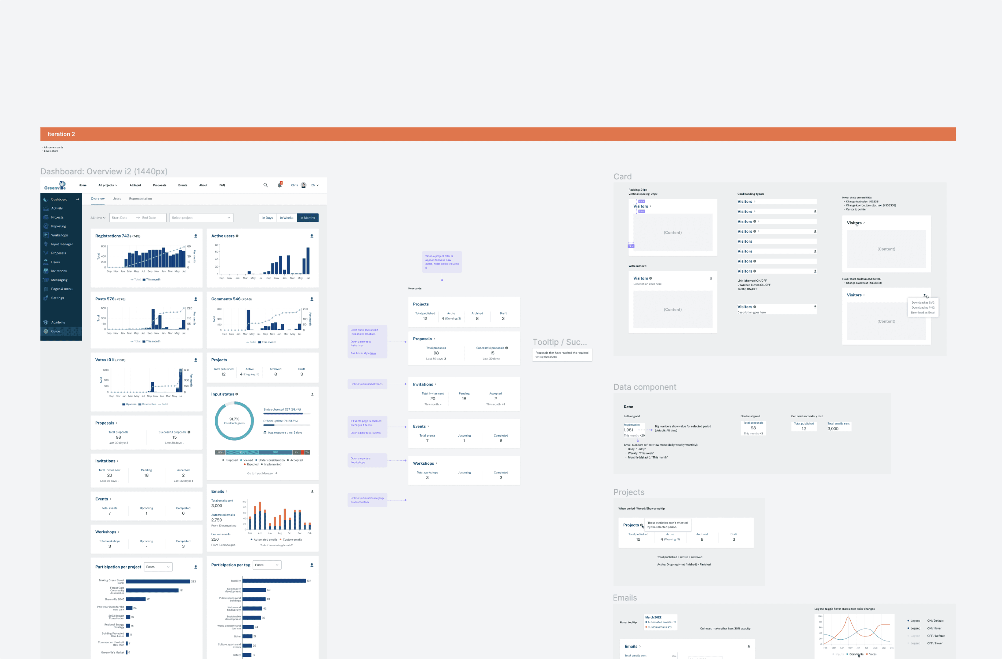
Overview: A snippet display of all information, with detailed insights available in other linked dashboards.
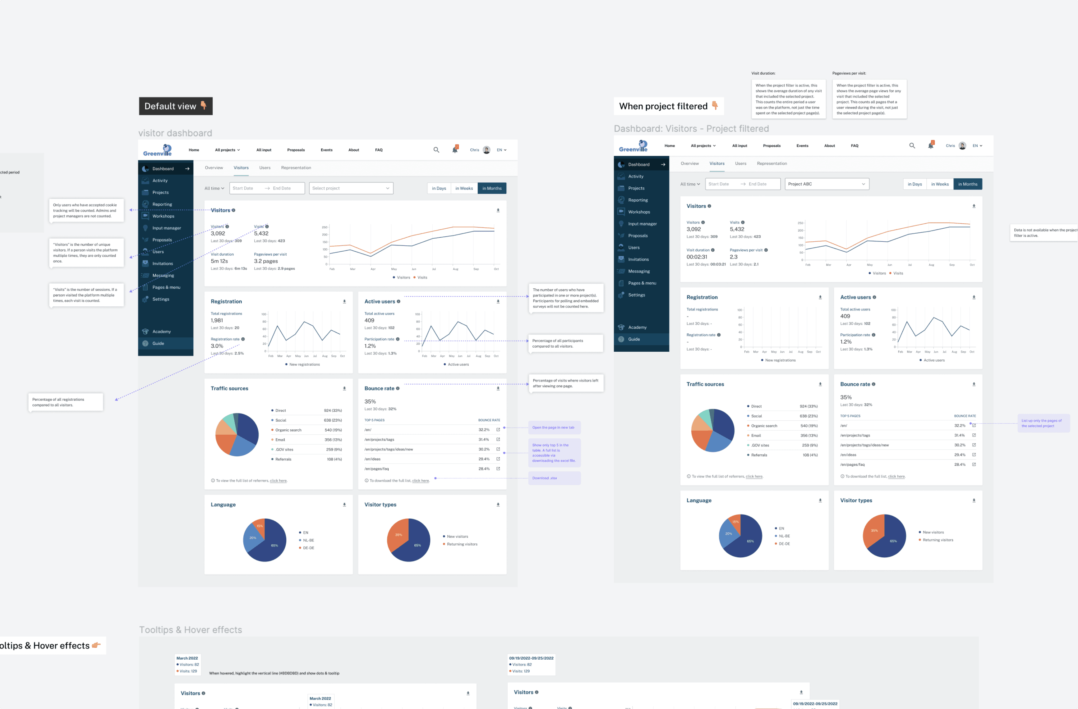
Visitors: Integration of data from Matomo, encompassing session details, traffic sources, and user demographics, which were previously unavailable on our product.
Projects: Overview of projects, including status and participation stats.
Representativeness: Illustrating similarity between the demographic distributions of registered users and total residents in the city.
In addition to addressing data-related questions, we also considered general feedback received, such as:
“It’s not clear what the filters do.”
“I want to download the graphs in other format than SVG.”
“Current dashboard lacks some vibrancy. More colors will be nice.”

Meeting up with cities
Product manager and I went through 3 customer interviews, in which we encouraged users to complain about current dashboard, check if they can locate various data components throughout the product, and gauge their understanding of the charts and data presented. Main learnings were:
It’s important to make dashboard look alive, in any cases. For these users I met, their dashboards looked surprisingly empty. This is because lots of data on dashboards was about a specific engagement method (ideation), while only a half of platforms are using it.
Many didn’t know where to spot some data they need, even though it was available within the platform.
For some, it was not clear what each stat means on the dashboard.
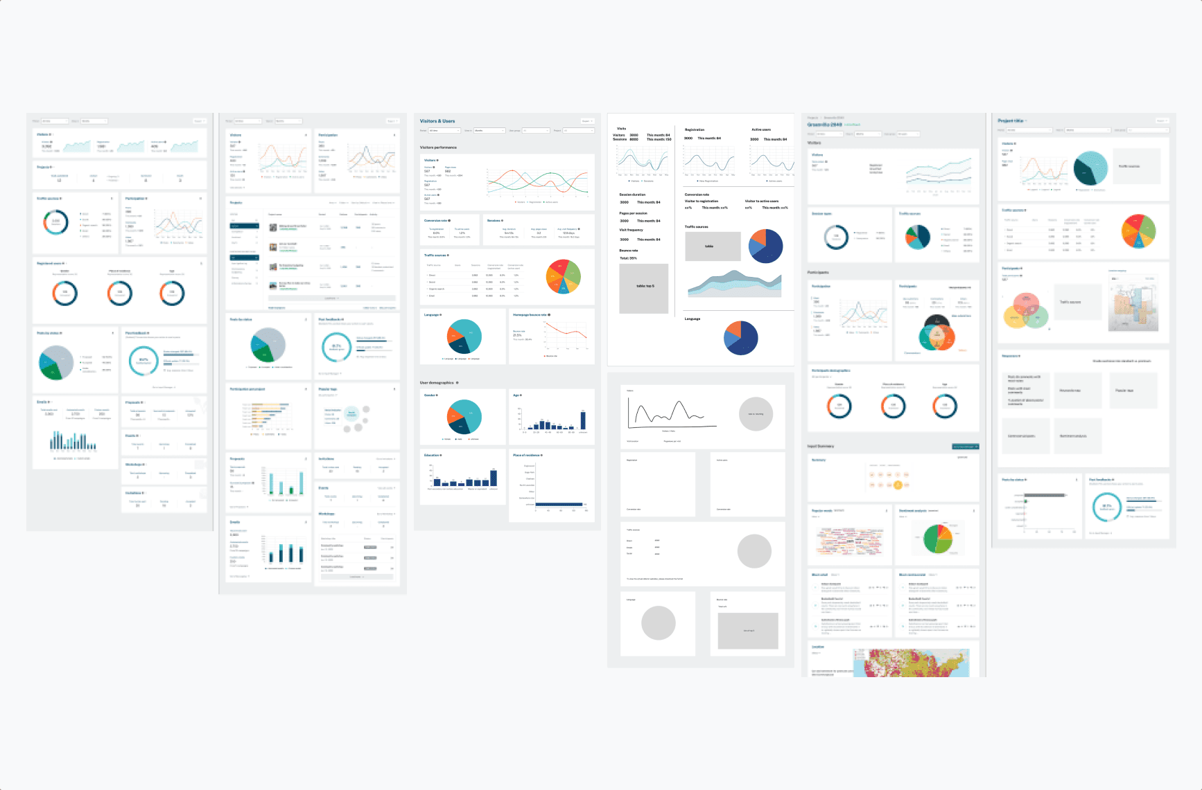
Dashboard structure: Shuffling and reshuffling
As we were talking about numerous data pieces in multiple domains, the first big design question was: “Which dashboard should contain this particular information, and where exactly should it be located?” I wanted to get this right before working on details for each dashboard element, but it gave me a fair amount of headache as data pieces were interconnected and could be grouped in numerous ways. Ensuring that the filters on each dashboard logically corresponded to the data elements presented added an additional layer of complexity.
Also, as we went, we had to scale down on data and dashboard we implement, so the dashboard structure had to be adjusted many times until the end of implementation.
Data visualisation
I explored different data visualisation options for each data piece. I also took a one-day online bootcamp for data visualisation to gear myself up with the necessary knowledge and mindset, where I learned how same data can be visualised in a different way and can tell a whole lot of different story.
For example, how to best visualise community representation, which compares the demographic distributions of registered users and total population? This was to inform platform admins about how representative their platform is. For example, does the community platform have enough voice from people of color, comparing to their actual ratio in the community?
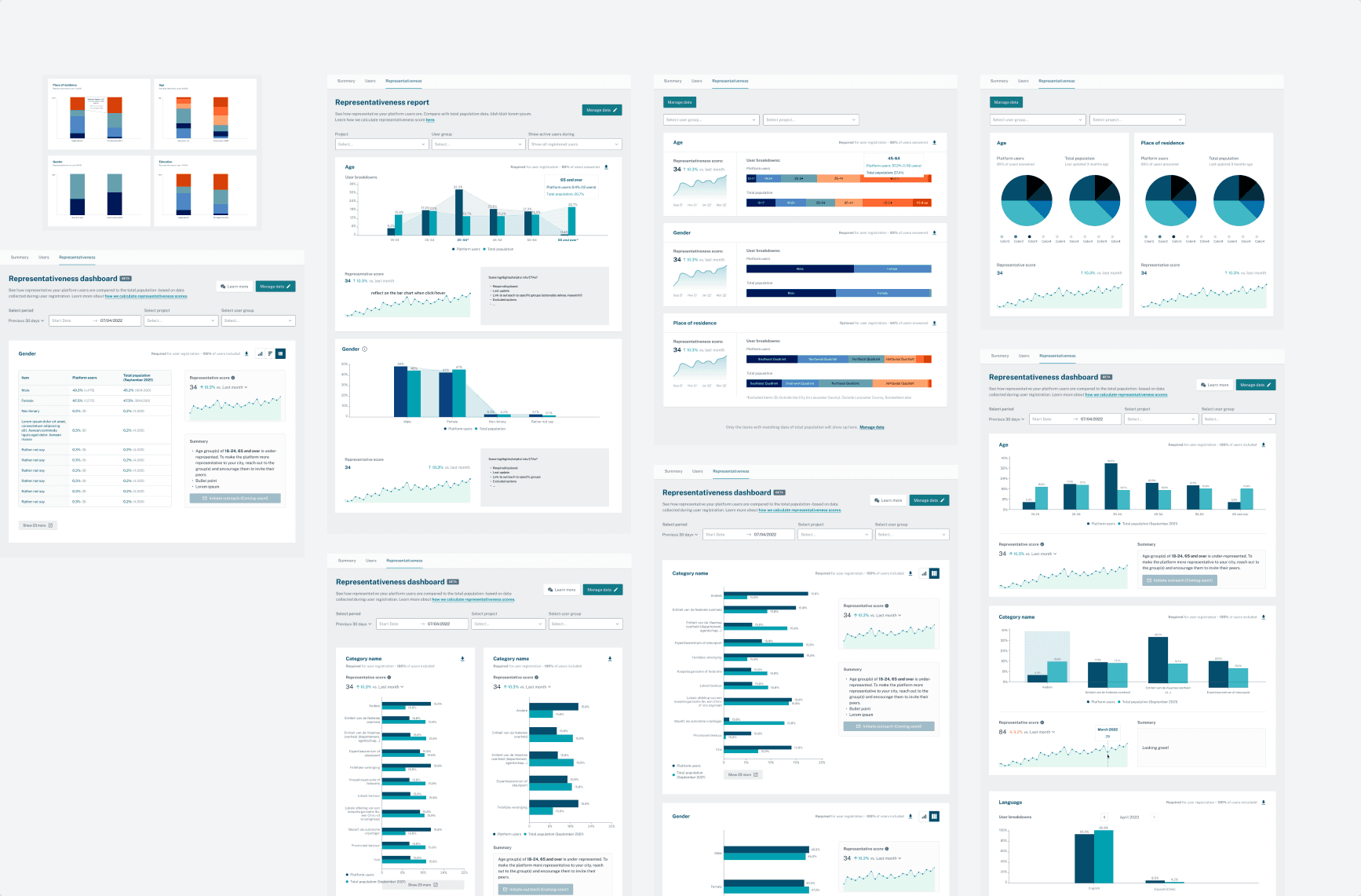
After exploring different layouts and chart types, I concluded that vertical bar charts, comparing one category at a time, would be the most effective choice. I initially considered adding line charts so that the difference in composition is more visually prominent. However, it turned out that lines could incorrectly imply “trends” between categories: so it only makes sense when there is a continuity (i.e. age groups), but does not with most demographic dimensions, which are categorised (i.e. gender, place of residence, education).
Prototyping: Consistency, vibrancy, and details
I focused on establishing a standardised framework for data card frames and how statistics were displayed, so users learn how to read the information once and easily apply to all. For stats, big numbers stand for values for the selected period of time, while small numbers served as reference value, be it last 30 days, last 7 days or yesterday.
For colors, I selected 10 colors that can be used on charts. Starting from a handful of brand colors, I made variations and ordered them in a way that neighboring colors on the charts have sufficient contrast. I also paid attention to color accessibility, ensuring that the colors pass color blind tests.


For chart implementation, we implemented custom chart UI using recharts, and small gaps were for us to fill. I designed consistent hover tooltips with detailed information, and empty status for each card as well.

Validation with users, and looking ahead
When the prototype was drafted for Representativeness Dashboard, we ran 3 customer interviews where I did some usability testing and sought input regarding potential iterations in the future. For the latter, we listed up potential functionalities to add and make interview participants to do a weighted vote.
Scaling down: I let my design go
As the dashboard work has a lot to do with sanitising database and unlocking third-party data, it took more time than expected for the devs. As a result, we faced the challenge of limited time, leading to the need to scale down the scope of the project. Unfortunately, this meant that three out of the four dashboards had to undergo significant reductions in functionality and features.
I had to come up with a contingency plan aimed at maximizing improvements to the existing dashboards with minimal additional development effort. That is, to keep the current UI and data cards as much as possible.
Outcome
As we introduced a lot more data onto the product, customers can now access new data directly through the dashboards, instead of manually inquiring to us. Data is laid out more consistently in style and colors, which makes this ‘homepage of the backoffice’ more delightful and professional. To provide further clarity, we have implemented hover tooltips and introduced a table view for easier data exploration. Additionally, we have expanded the export options to include the widely requested .png format.
Retro-spective
Because of scaling down at last, some major problem wasn’t fully solved: that the dashboard look empty for customers who don’t use a specific project type, and how the stats were calculated was confusing to many. Adapting to last-minute plan changes is always challenging, but this experience has taught me once again how to find the best possible solutions given the constraints.
That's it! Thanks.

© 2023 Made by Yaesul